
There's a practical reason we do this before the traffic stage. Etsy watches how well your listings convert, and listings that turn visits into orders get shown to more shoppers (because the better the listings convert, the higher the chance Etsy gets paid). Conversion isn't just about making the most of the traffic you have. It's also how you get Etsy to show your listings to more people.
Think of this stage the way you'd set up a workbench: Everything in its place before the real making begins. It takes time in the beginning, but helps everything running much smoother down the line.

Before a shopper reads a single word, they take in the whole picture: Your photos, your banner, your colours, the way everything fits together. A brand isn't a fancy logo. It's the feeling of walking into a well-kept studio where someone clearly cares. And that feeling is built from a handful of simple, repeated choices.
Here's the full kit an Etsy shop actually needs. It's shorter than you think:
- A positioning sentence (who you serve and why you're different)
- One colour palette: a primary, an accent, and one or two neutrals
- Two fonts: one with personality for headings, one plain workhorse for everything else
- A simple wordmark logo
- A few brand voice notes
Everything else, from your banner to your packaging labels, is those five ingredients rearranged. Which is exactly why you can build the whole suite in an afternoon.
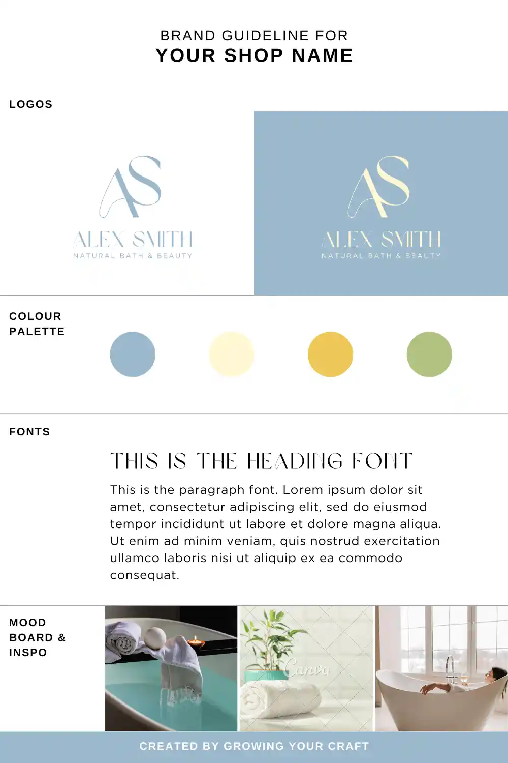
One shortcut before we start: if you'd rather have the whole visual identity decided in one move, the Branding Guidelines in your Toolbox are ready-made branding sheets, each one a complete matched set built around a logo from the Logo Designs pack (with colour palette, secondary logo, and heading and body fonts already chosen to work together). Pick the sheet that fits your positioning, swap in your shop name, and you can jump straight to the assembly line at the end of this step. The walkthrough below is for building your own from scratch, and it's worth a skim even if you take the shortcut, so you understand why yours works.
1. Gather inspiration before you choose anything
Give yourself 30 to 45 minutes, no more. Open Pinterest and Dribbble and search terms near your craft: "pottery branding", "candle packaging", "jewellery shop logo". Save what makes you pause. Then look around the real world: the cafe menu that you love, packaging you've kept because it was too nice to throw away, market stalls that made you do a double take.
Finally, revisit the 5 competitor shops from your Stage 1 research, but with a different question this time: what does everyone in my niche look like? If your corner of Etsy is wall-to-wall soft pastels, sometimes going for something a bit different will help you stand out, like a warm, earthy palette makes you recognisable among your competitors. You're scanning for the gap, not for something to copy.
When you have 10 to 15 saved images, lay them out together. What keeps repeating is your taste, telling you what it wants.
2. Write your positioning sentence first
One line: "I make [product] for [customer] who want [feeling or outcome]." For example, "I make hand-poured soy candles for renters who want their small space to feel like a sanctuary."
Do this before touching colours or fonts, because it filters every choice that follows. A brand for playful baby gifts and a brand for minimalist leather goods would never pick the same font, and this sentence is how you know which one you are.
3. Choose your colours with your products in the room
Pick one primary colour, one accent, and one or two neutrals. That's the whole palette. The Branding Guidelines mentioned earlier give you 30 ready-made combinations if choosing from scratch feels paralysing.
One test before you commit: drop the palette next to three of your product photos in Canva. Your brand colours should frame your products the way a good gallery wall frames a painting. If the palette competes with your work for attention, the palette loses. Adjust and test again.
Then stop choosing. A decent palette used everywhere beats a perfect palette you keep second-guessing.
4. Pick your two fonts
One heading font with some character, one body font that is readable and not 'fancy'. The pairing rule: one heading font, and one body font. Two decorative fonts will fight each other, and two plain ones may not help you stand out. Again, the Branding Guidelines pairings are some of my suggestions.
Before locking in, test both at small sizes on your phone, because that's where your shopper is. If your heading font isn't readable at thumbnail size, it's a nice piece of art, not a brand font.
5. Define your voice in three adjectives
Choose three words for how your brand talks, like "warm, knowledgeable, a little playful", and write one example line of what you'd say and one you wouldn't. (For example, we say: "Made slowly in small batches", but not: "BUY NOW, LIMITED STOCK!!") This tiny note keeps your descriptions, customer messages, and captions sounding like one person, which is precisely what shoppers trust.
6. Make your logo the Easy way
Etsy shops don't need iconic logos. They need simple, consistent ones. Open the Logo Designs templates, set your shop name in your heading font, pick the layout that suits your positioning, and adjust the colours to your palette to test out your favourite one.
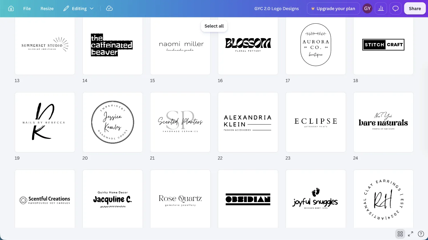
Two notes here. First, the only real requirement: your logo must stay legible as a 500 by 500 pixel shop icon. If it works small, it works everywhere. Second, every logo design in the pack has a matching branding sheet in the Branding Guidelines: the same logo with its secondary version, plus a palette and font pairing already tuned to suit it. If you built your kit from scratch and something feels like it's fighting, borrowing the matched sheet for your chosen logo is an honest fix.
7. The afternoon assembly line
Now the rest of your branding assets . Put your brand board (or your chosen branding sheet) beside you and batch your way down this list, applying the same palette, fonts, and logo to each template at the right size:
- Shop icon: your logo at 500 x 500 px
- Shop banner: 1600 x 400 px (Shop Banner Templates)
- Shop cover photo: 3360 x 840 px
- Order receipt banner: 760 x 100 px (Order Receipt Banner Templates)
- Instagram post templates: 3:4 portrait, at least 2000 px wide (2000 x 2667 px)
- Instagram story highlight icons: 1080 x 1080 px (use the Instagram story icon template, or just put your brand font on top of your brand coloured background)
- Pinterest pins: 2:3 portrait, 1000 x 1500 px (Pinterest Pin Templates)
- Pinterest profile banner: 16:9, at least 800 x 450 px
- Thank-you card: A6 (105 x 148 mm) at 300 DPI is a safe print size
- Order insert card: business card size (89 x 51 mm) or A7, at 300 DPI (its job is coming in the next step)
- Packaging label or sticker for the next step
Because every asset is the same five ingredients rearranged, this is assembly, not design. One focused afternoon, and your shop, socials, and packaging all recognisably belong to the same maker.
Go deeper: Positioning & Identity (the thinking that makes every brand choice obvious)
Toolbox: Logo Designs · Branding Guidelines · Shop Banner Templates
Here's a truth worth building the whole shop around: your customer doesn't just buy a mug. They buy the moment a parcel arrives, the small theatre of opening it, and the feeling of having chosen well. The unboxing isn't something you sort out later, after sales start. It's part of the product, and like every part of the product, it affects your overall customer experience.
There are three practical reasons it belongs this early. Packaging has a real cost per order, and that cost needs to be in your price (which we set in the very next step). Gift wrapping and a beautiful parcel deserve to appear in your listing photos (coming in Step 4). And your packaging carries something quietly strategic that you'll want working from your very first order, which we'll get to below.
Your packaging works in four layers, from the outside in:
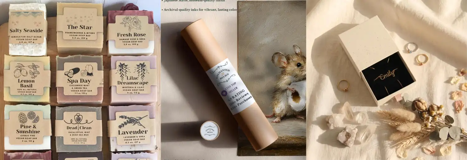
The shipping layer. The mailer or box the world sees. A logo sticker, a rubber stamp, or a strip of washi tape turns a brown box into a small event on a doorstep. Cheap, fast, and unmistakably not Amazon.
The presentation layer. What they see when they open it: tissue in a brand colour, a wrap, a ribbon. It doesn't have to be too extravagant, one small, intentional touch is enough. The aim is to show that you care.
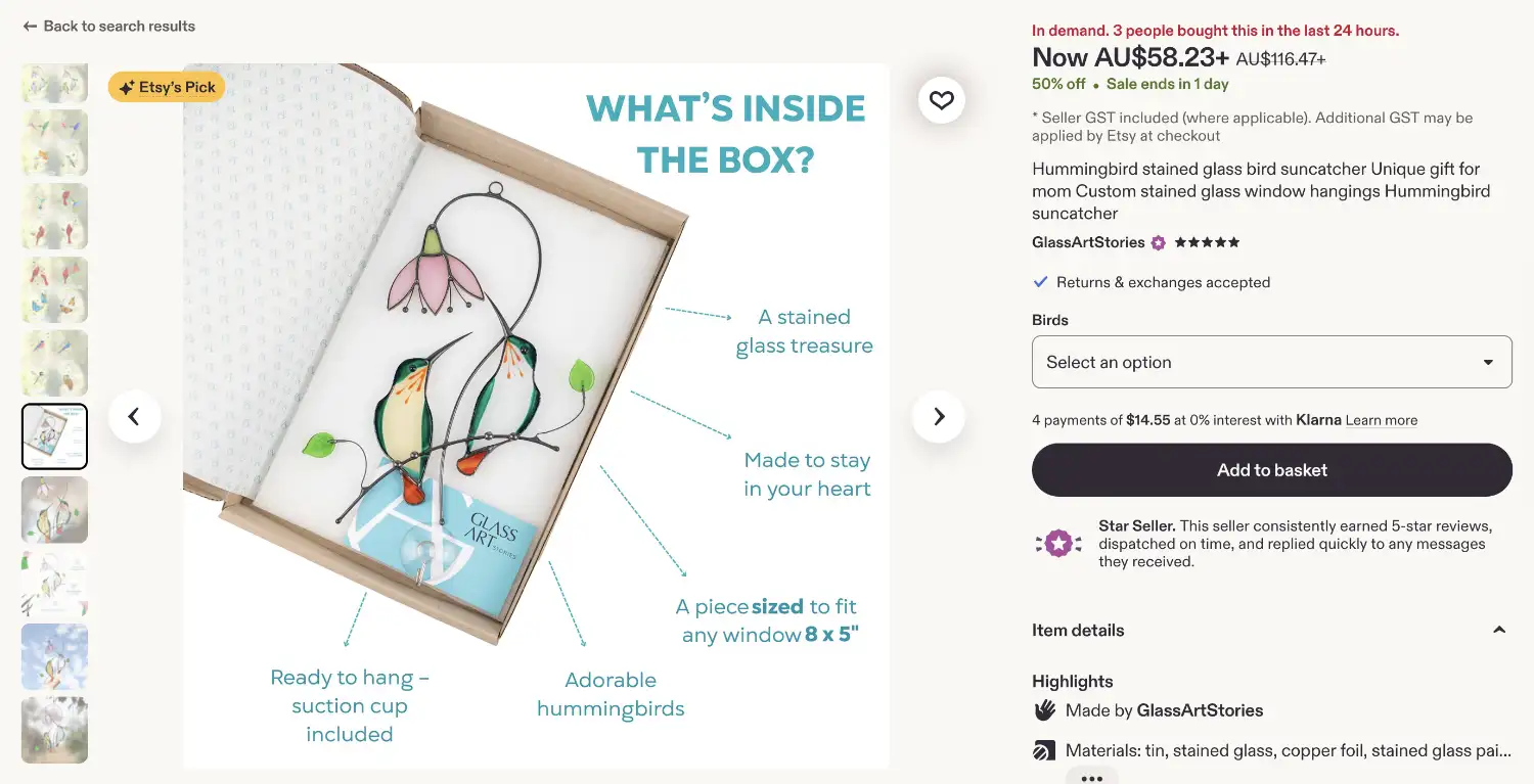
The connection layer. The thank-you card and label from the Step 1 assembly line, a handwritten line with the customer's name (the highest-value thirty seconds in your whole fulfilment routine), care instructions, and, if margin allows, a tiny freebie. And one more thing, the strategic one: the order insert card. A small card with two jobs on it: a friendly review prompt ("loving it? a review means the world to a small shop"), and a QR code linking to your shop, social media, or email signup (more on email in Stage 4). Think about what that little card does. Etsy sent you a customer, and the insert's job is to invite them to become yours too, someone you can reach again without paying anyone or ranking anywhere. It will be doing serious work in Stages 3 and 4. (Canva can generate the QR code for you in a few clicks.)
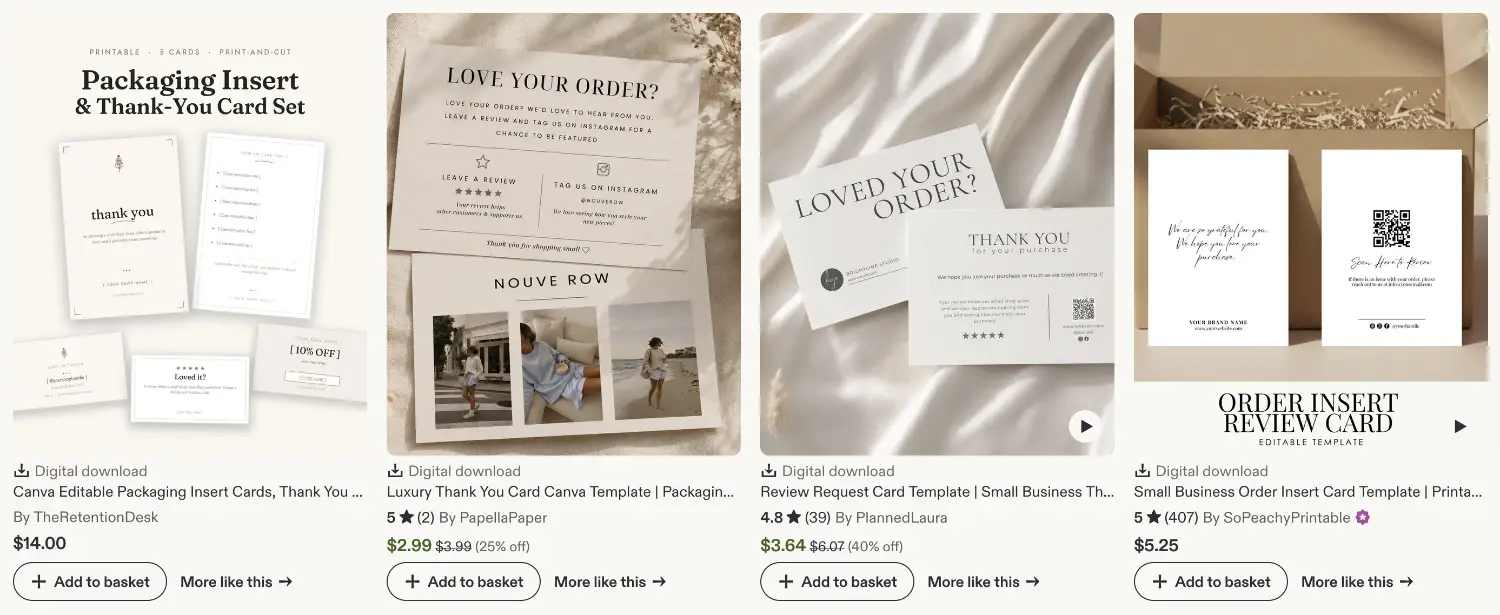
The product layer. Whatever directly holds the piece: the jewellery box, the soap band, the sleeve. It should look like it belongs to the same brand that made everything else, because it does. Also consider protective elements that will make sure your product arrive in perfect condition in your customer's hands.
Extra note for digital sellers: You still have an unboxing. It just happens on a screen. Your four layers become the delivery experience: a cleanly organised download (sensible file names, folders that explain themselves), a branded "start here" PDF that welcomes the buyer and shows them how to use or print what they bought, and, if margin allows the digital equivalent of a freebie, a small bonus file that adds value to their main product. And your insert card becomes a page inside the download itself: a warm thank-you, a friendly review prompt, and a link or QR code to your shop and socials. Build it once and it ships with every order forever, which makes it the hardest-working page you'll ever design.
Two rules to keep in mind. First, intention beats spend: a stamped mailer, coloured tissue, and a handwritten line cost relatively little, photograph beautifully, and read as more care (and 'handmade') than an expensive box with nothing personal inside. Second, tally the real per-order cost of everything you choose, right down to the sticker, and write it down. That number walks straight into the next step's cost sheet, which is exactly why we designed the parcel before pricing it.
Go deeper: The Packaging Sourcebook (what to buy at three budgets, and where)
Here's the thing about pricing low: it doesn't just shrink your profit. It also changes how shoppers perceive your creation. Most handmade Etsy sellers price their products too low, which unfortunately makes them compete directly with mass-produced products. When someone sees a hand-stitched tote priced like a fast-fashion one, they don't think "bargain". They think "something must be off" and that "it is probably not handmade". Your price is part of your product photo, in a way. It sets expectations before your actual listing photos and description.
And there's a second trap hiding in low prices: they're usually built on invisible labour. If your hours at the bench aren't in the price, you haven't found a competitive edge. You've just agreed to work for free.
So we price the way you'd finish a piece: deliberately, with every cost accounted for. Here's the method I recommend. Use the Pricing Calculator along the way.
1. Add up your materials, honestly
List every material in one finished piece and what it costs at the quantity you actually buy. Include the waste: if one piece in ten comes out of the kiln cracked, your materials cost is really 10% higher than the receipt says. Build that in the cost.
2. Add your packaging
The mailer, the tissue, the sticker, the thank-you card, the insert. You designed all of it in Step 2 and wrote down the per-order cost, so put that number total on the sheet. They may seem small, but as it's for every order, you need to take that into account.
3. Pay yourself a real wage
Time one full make, start to finish, and multiply by an hourly rate you can live with. Set a floor at your local minimum wage and aim above it. This number matters more than any other on the sheet, for a simple reason: if your labour was never in the price, you can never afford to hand the work to anyone else and expand your business own the line, and your business stays a underpaid job forever.
4. Add a slice for overhead
Your tools, your Canva subscription, your email marketing service, the lamp you bought for photos. You can either add all the per-month costs together and divide that with an estimated number of order by month, or rather than tracking every dollar, you can add 10 to 15% on top of materials, packaging, and labour. Rough is fine.
Add those four together and you have your true product cost.
5. Account for Etsy's cut, the right way
Etsy's mandatory fees (transaction, payment processing, and listing) typically take 10 to 12% of your sale price, and note that the transaction fee applies to the shipping you charge, too. Here's the part most sellers get wrong: you can't just add 11% on top of your cost, because the fee is charged on the final price, not on your cost. So we divide instead:
Price = (true cost + the profit you want) ÷ 0.89
Dividing by 0.89 grosses your price up so that after Etsy takes its roughly 11%, the number you wanted actually lands in your pocket.
6. See it with real numbers
A ceramic mug: materials $6.00, packaging $1.50, labour 30 minutes at $24 an hour is $12.00, overhead at 10% adds $1.95. True cost: $21.45. You want $8 profit per mug, so you need $29.45 in your pocket. Divide by 0.89 and you get $33.09. List it at $34.
Twenty minutes of simple maths, and you'll never panic-discount again, because you'll know exactly where your bottom line is.
Extra note for digital sellers: Your cost sheet may look different, but the principle of going through this step is not. Materials, packaging, and shipping fall away, and your labour spreads across every copy you'll ever sell, which tempts sellers towards prices near zero. Resist that. Price against the value delivered and the serious end of your market, not against your per-copy cost, because a race to the cheapest in digital product niches is even more brutal than in physical products, and just as unnecessary. The rest of the step still applies exactly: Etsy's fees still take their percentage, the divide-don't-add maths still protects your pocket, and the margin-for-sales rule still matters, since discounts remain one of your best marketing levers.
7. Leave room to run a sale
One caution before you settle on "the profit you want" in the last part: Make sure not to put a zero. Your margin isn't only your pay. It also gives you room to run promotions, because every discount you'll ever offer comes straight out of it. Run a 15% off sale on a 10% margin and you're paying shoppers to take your work away. And if you put zero in your profit margin, that means you don't have room to run sales.
And you will want to run sales. A well-timed discount is one of the most powerful marketing tools on Etsy, especially around the holidays, and we'll be discussing how to do that in the stages ahead. So build in a margin generous enough that a meaningful sale, say 15 to 20% off, still leaves real profit behind. A thin margin means your ability to run sales is taken away from you, which could truly hurt the longevity of your Etsy shop.
8. Sanity-check against the market, then hold your nerve
Pull up the five competitor prices from your Stage 1 research. If your number lands inside their range, wonderful, you're done. If you're above the range, resist the urge to quietly delete your labour. You have two honest options: trim real costs (cheaper mailers, batching your production), or raise your perceived value so the price feels right. Perceived value is exactly what this stage builds: better photos, visible craftsmanship, and the thoughtful packaging you just designed.
If you're below the range, put your price up so that yours is just below your competitors. I'd aim for about 5-10% below. Handmade is the premium shelf, so you need to price like you belong on it.
One last practical note: if you sell to US shoppers, orders over $35 with free shipping get a boost in Etsy search, and since fees are charged on shipping anyway, adding the delivery & shipping into your price and offering "free shipping" often costs you nothing and helps you rank better.
Go deeper: Charging More With Confidence (ten ways to raise what your work is worth)
Toolbox: Pricing Calculator
Photos do most of the selling on Etsy, and it's worth pausing on why. Your shopper can't pick up your product, feel its weight, run a thumb over the texture, or hold it up to the light. Your photos have to do all of that on their behalf. Every question a photo answers is a doubt removed, and every doubt removed is a step closer to them pressing the buy button.
The good news: you don't need a studio, a fancy camera, or a photography course. You need a window, a repeatable process, and a shot list. Here is my recommendation:
1. Know the shot list before you pick up the phone
A complete listing gallery has a job for every photo. Aim for at least 7, covering:
The hero shot. Your thumbnail, and the single most important image in your shop. Product filling the frame, clean background, bright and crisp. Its only job is to earn the click in a wall of search results.
/
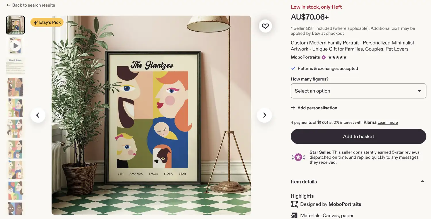
The angles. Front, back, side. Shoppers notice when a listing only shows one side of something, and they wonder why.
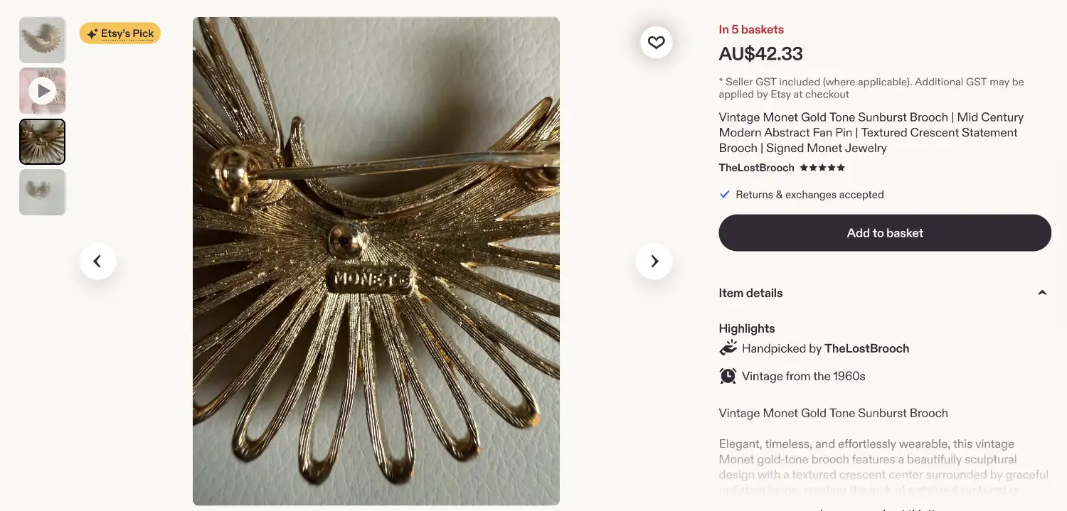
The detail. A close-up of the texture, the stitching, the glaze, the grain. This is where handmade quality lives, so get close enough to prove it.
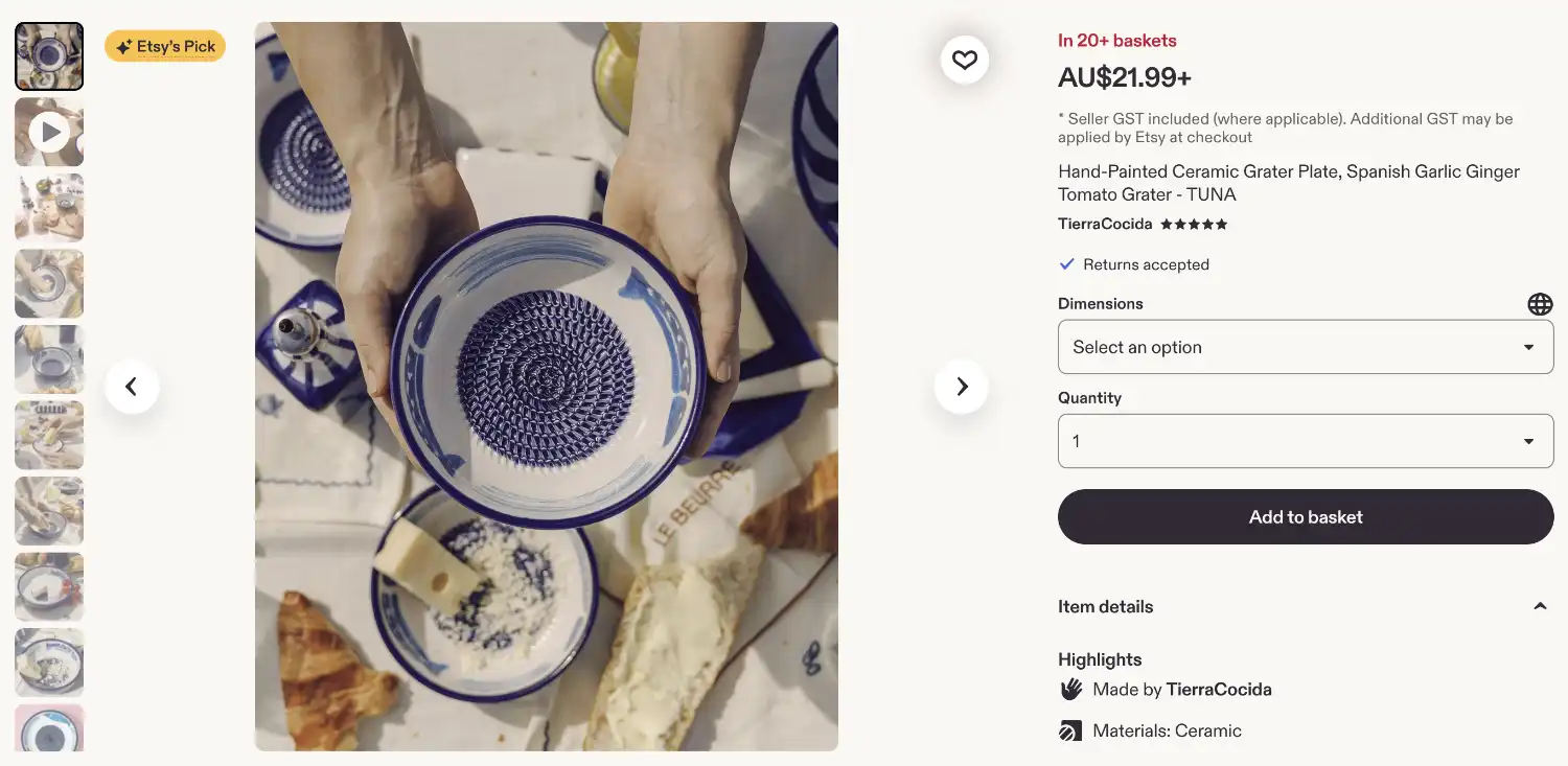
The scale shot. Your product in a hand, or next to something universally familiar. "Smaller than expected" is one of the most common reasons why shops get negative reviews on Etsy, and this one photo prevents it.
The lifestyle shot. The product in its natural habitat: the mug on a breakfast table, the print on a real wall. This is the photo that lets a shopper picture it in their own life.
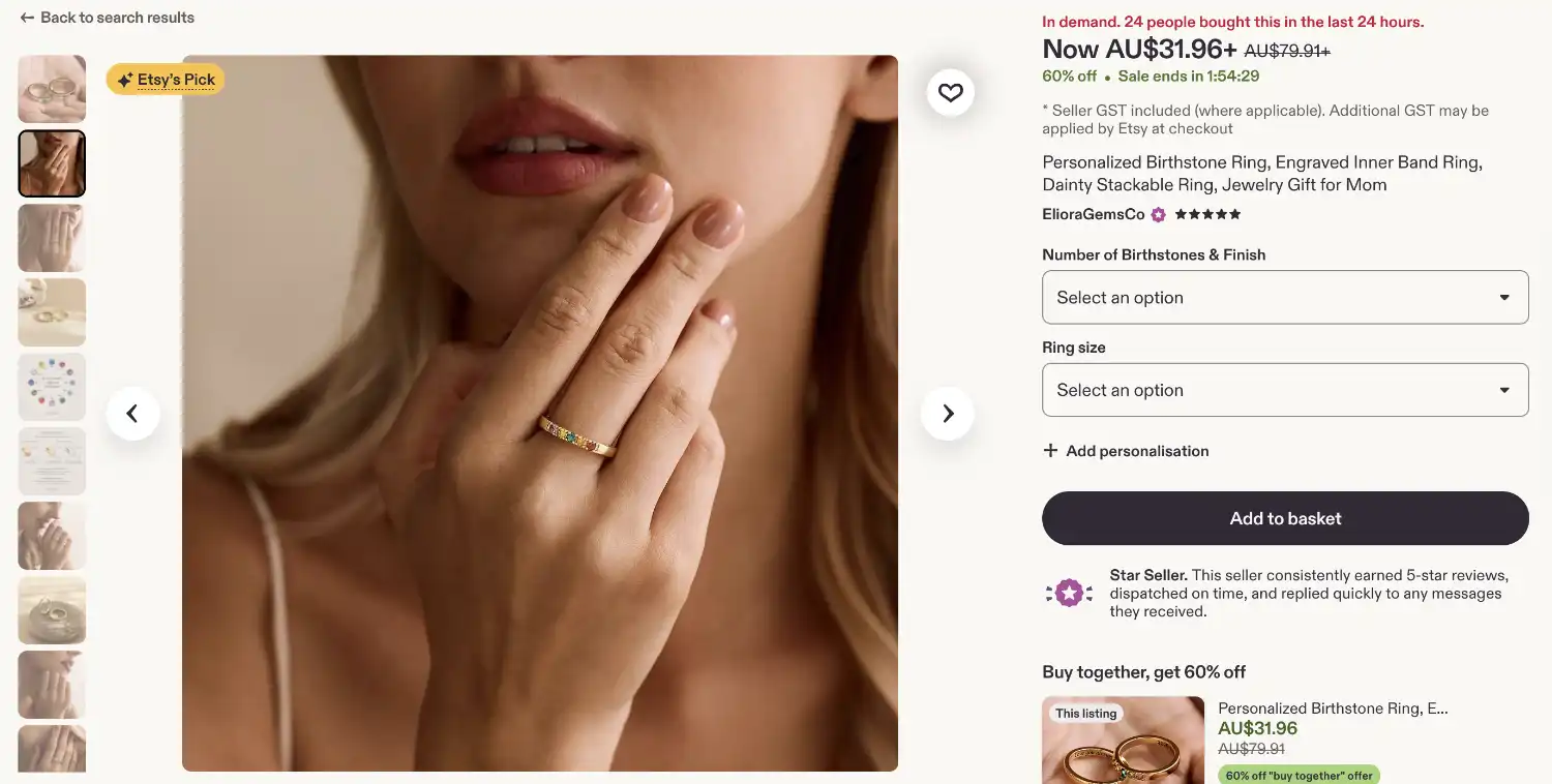
The options. If you offer colours, sizes, or personalisation, show the range in one photo.
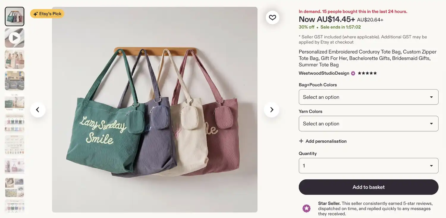
The packaging shot (show that your product is giftable). The parcel as your customer will meet it, wrap and all, straight from your Step 2 design. If you offer gift wrapping, this is where you show it, exactly as your description will promise.
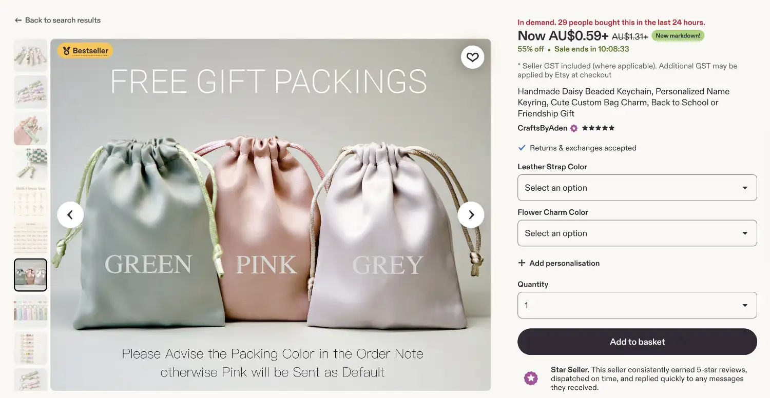
The informational photos. Use the 250 Listing Photo Templates in the Toolbox to add graphics for dimensions, materials, and your USP in words a skimming shopper can catch. Keep any text large enough to read at thumbnail size.
You'll add one more photo and a short video to this list in the next step. They may turn out to be the most persuasive pieces of the whole gallery.
Extra note for digital sellers: your "photography" is mockups, and the shot list translates almost one to one. The hero shot becomes your design shown beautifully in use: the art print framed on a real-looking wall, the planner open on a tablet, the SVG on a finished tote. The detail shot becomes close-ups of your design's craft. The scale and options shots become a clear "what's included" graphic: page counts, sizes, formats, everything in the bundle laid out visually. And the listing video becomes a slow flip-through of the pages or an on-screen scroll of the files, which does for a digital product what turning a mug in your hands does for a physical one: proves there's real substance behind the thumbnail.
2. Shoot with the window method
Set up next to a large window with strong, indirect light. Overcast days are secretly the best days. Direct harsh sun creates hard shadows and also could create a photo with slightly inaccurate colours in some phone cameras. Turn off the ceiling lights (mixed light sources affect your colour accuracy), put a piece of neutral-coloured card or paper behind and beneath the product, and if one side looks too dark, prop a sheet of white paper opposite you window to bounce light back to the dark side of your product. That's the entire studio that you can set up in 10 minutes, and it cost you almost nothing.
Your phone camera is more than good enough. Tap the product on screen to focus, drag the exposure down a touch so nothing washes out, hold steady or lean your elbows on something, and shoot more than you think you need. Change the angles and compositions slightly for every shot. Take ten frames per shot on the list, and then you can pick the best two to use.
And batch it: photograph as many products as you can in one session while the light and setup are already perfect. This habit will save you time in the long-run.
3. Edit for true, not for pretty
Editing has one goal: make the photo look like the product does in real life, on a good day. In Canva or Lightroom Mobile, nudge the brightness up, lift the shadows and contrast, and correct the white balance until whites look white and your colours look like themselves.
Resist filters for your product photos. A moody filter might work on Instagram, but it loses the review when the parcel arrives and the colour is wrong. Accurate photos are quietly one of your best defences against returns and disappointed buyers.
Go deeper: The Conversion Masterclass (the six gates every shopper passes, the informational photo system, and bestseller anatomy by niche)
Toolbox: Listing Photo Templates
Read more into this topic: Deep Dive - The Human-Made Advantage
Your shopper in 2026 is scrolling past AI-generated designs and dropshipped products dressed up in handmade clothing, and they've become a little more suspicious. That suspicion is your opportunity. The sellers winning trust right now are the ones who make the human impossible to miss.
And here's the lovely part: proving you're a real maker is also exactly what Etsy's own rules now reward. Original work, honest disclosure, a visible process. Differentiation and compliance turn out to be the same craft. There are five proof points to build, and none of them takes more than an afternoon.
1. Write your maker story
Your Etsy shop about section, 1-2 honest paragraph, built from three questions: who you are, how the work gets made (the place, the process, roughly how long a piece takes), and why you make it. You can start with something like: "I'm Elena, and every candle in this shop is poured in small batches in my home studio in Melbourne. I started making them when I couldn't find one that didn't give me a headache."
Notice what that paragraph isn't: polished, clever, or long. Honesty reads as honesty. Add a photo of you in your workspace, hands visibly mid-task, and the story becomes undeniable.
2. Put the process in every gallery
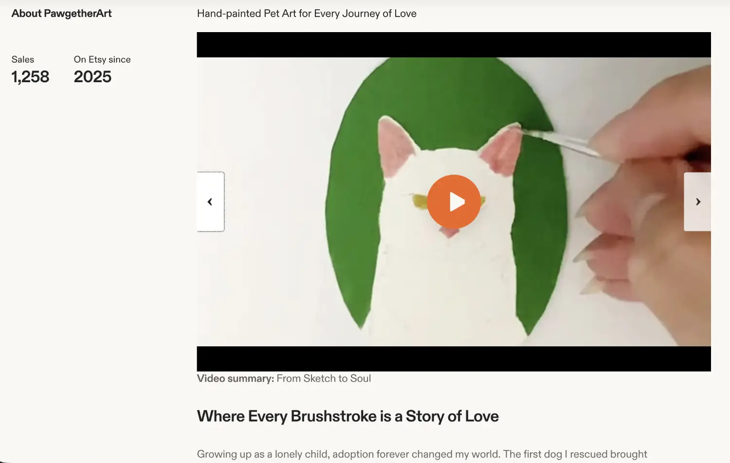
Add one process photo to every single listing: your hands shaping the clay, the stack of cut fabric, the piece half-finished on the bench. This is the photo that answers the question shoppers are quietly asking of every listing now: "did a person actually make this?" You already have the raw material; you literally just have to take a photo of it and show it.
3. Add a listing video
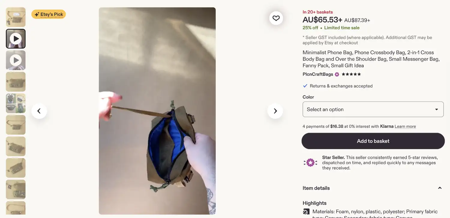
If you do only one thing from this step, make it this one. Etsy listing videos play silently on a loop, 5 to 15 seconds, and they out-persuade any photo for one simple reason: they're the hardest thing on the page to fake.
You have two easy formats, and both work. The first is a behind-the-scenes process clip: the pour, the stitch, the sanding, ten seconds of the thing being made. The second is even simpler and criminally underrated: you, holding the product, slowly turning it in your hands. That one silent clip proves a human exists, shows true scale better than any photo, and lets the shopper see how the piece moves and catches real light.
No editing needed, no sound needed, phone camera is plenty. Film it right after your Step 4 photo session for that particular product, while the window light and setup are already perfect.
4. Add the maker's detail line
In each product description, include one sentence only a real maker could write. The quirk of the material, the step that takes the longest, the reason for the small variations: "Because each batch of clay fires slightly differently, your mug's speckle pattern will be one of one."
One sentence does three jobs at once: it proves your process, it sets honest expectations about handmade variation before anyone can be disappointed by it, and it gives the shopper a little story to tell when they hand over the gift.
5. Play by the rules, visibly
Finally, the compliance half, which takes twenty minutes and protects everything else. Check each listing against Etsy's originality standards (the design must genuinely be yours), fill in the "who made it, when, and what it is" fields accurately, and complete any required disclosures honestly, whether that's a production partner or any use of AI anywhere in your process.
This isn't just box-ticking. Policy violations drag down your shop's visibility, and takedowns can arrive without warning. A clean, honest shop simply gets to keep compounding while others get interrupted.
Extra note for digital sellers: this step matters more for you than for anyone else on the roadmap, because you're competing in the categories with the most AI-made products. Your process proof is the design process itself: a timelapse of the illustration taking shape, your screen mid-edit, the sketchbook behind the final file. Your maker's detail line is the design decision only you could explain. And the compliance half is not optional housekeeping in digital; Etsy's originality standards and AI disclosure requirements bite hardest exactly where you sell, so answer them honestly and visibly. In a sea of generated sameness, "a real person designed this, and here's the proof" is the single strongest differentiator a digital shop can own.
Go deeper: The Human-Made Advantage (the full proof audit, and why rough edges help)
Now everything comes together: Your photos, your video, your price, your proof of craft, your customer's own language. A listing has two jobs, and it must do both. First, get found: Etsy gathers every listing whose title, tags, and description contain the words the shopper typed, then ranks those matches by relevance, conversion, and how happy the shop's customers have been. Second, convert: the cover photo and title win the click, your product photos gets viewed, the listing description gets skimmed, the policies get a glance, and then, only then, the buy button.
So we build in that order. First we find the words shoppers actually type. Then we assemble the listing that persuades them. You're not writing from a blank page at any point. Here's the structure.
1. Think long-tail
A long-tail keyword is a specific phrase of 2 to 5 words with steady demand and manageable competition. "Necklace" is a crowd you'll get lost in. "Raw amethyst pendant necklace" is a conversation you can win. The specific phrase brings fewer searches, but the shoppers typing it know exactly what they want, and they're far closer to buying. On Etsy, specific beats big every time.
2. Get keyword ideas with the A-to-Z method
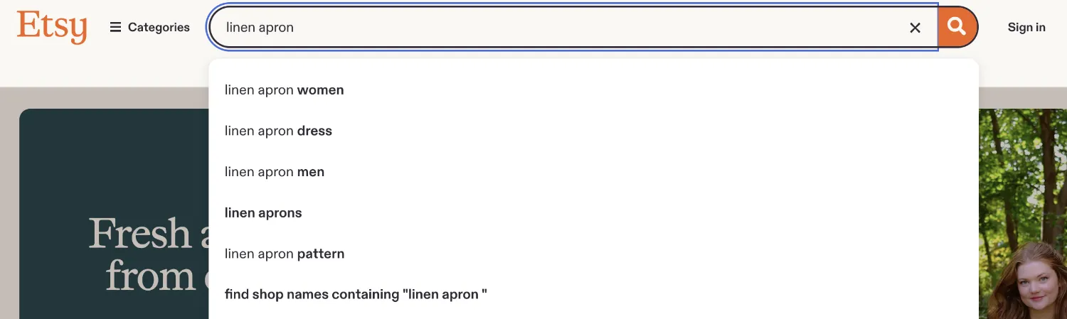
Open Etsy in an incognito window and type your product's seed phrase into the search bar, then add a letter after it: "linen apron a", "linen apron b", and so on down the alphabet. The autocomplete suggestions that appear are real phrases real shoppers have typed, and Etsy is handing them to you free, roughly ranked by popularity. Write down every suggestion that fits your product.
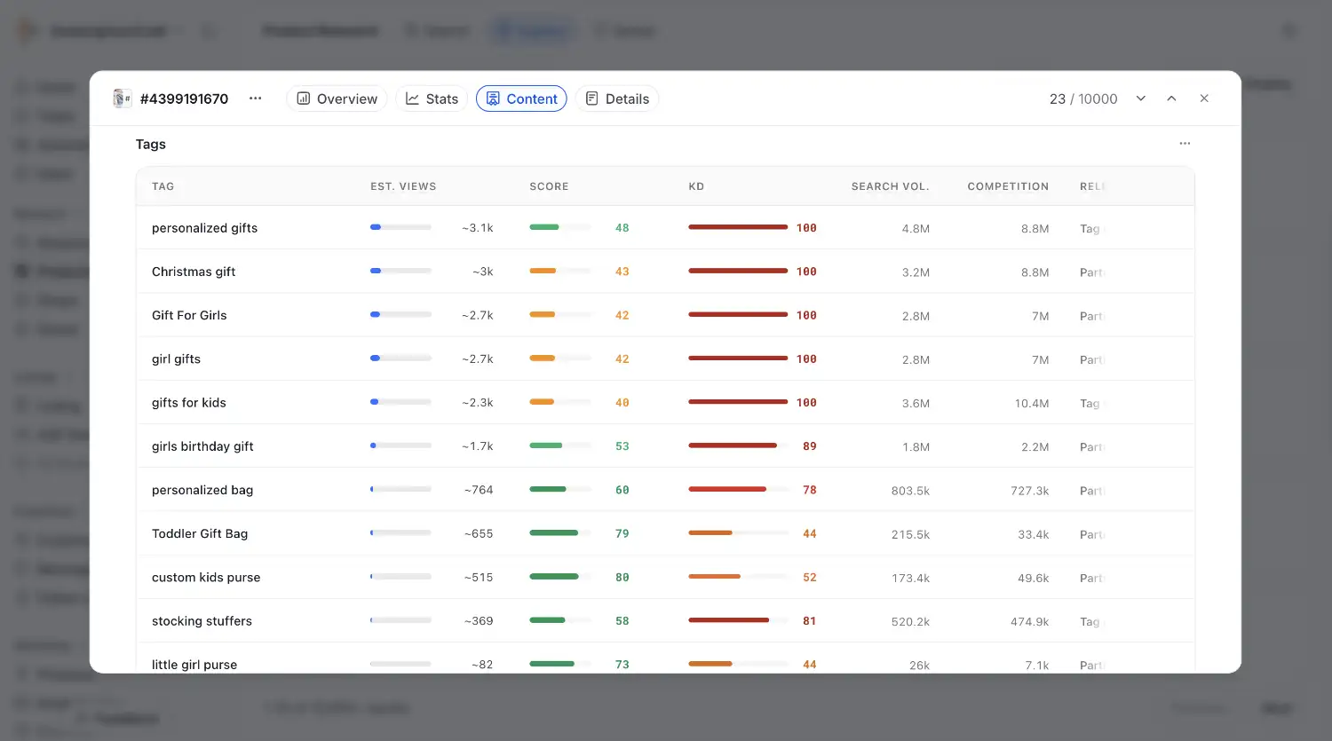
Then top up the list from two more sources: the related-search suggestions Etsy shows around your results, and the titles of the 5 competitor listings you studied in Stage 1 (their front-loaded words are their researched keywords, sitting in plain sight). If you use a research tool like Alura or EtsyHunt, this is where it earns its fee, putting search volume numbers on your list. Useful, but optional.
3. Choose your set
For each product, shortlist 15 to 20 keywords that balance two things: evidence of demand (they showed up in autocomplete, or the tool shows volume) and competition you can realistically enter. Search each phrase and glance at the result count; as a rule of thumb for a newer shop, phrases with fewer than about 5,000 results give you a real chance of being seen, especially when the first page looks beatable.
Mark your single strongest, most descriptive phrase as the primary keyword. It's about to go at the front of your title. The rest will fill your tags and description.
4. Build the title, front-loaded
Your primary keyword goes first, exactly as shoppers type it, because the front of the title carries the most weight with Etsy and with the human skimming results. Follow it with one or two secondary phrases, separated cleanly. Something like: "Raw Amethyst Pendant Necklace | Healing Crystal Jewellery | Birthday Gift for Her."
Keep it readable. A title stuffed until it's gibberish might match searches, but a human still has to want to click it, and keyword soup reads as spam to shoppers and increasingly to Etsy itself.
5. Use all 13 tags
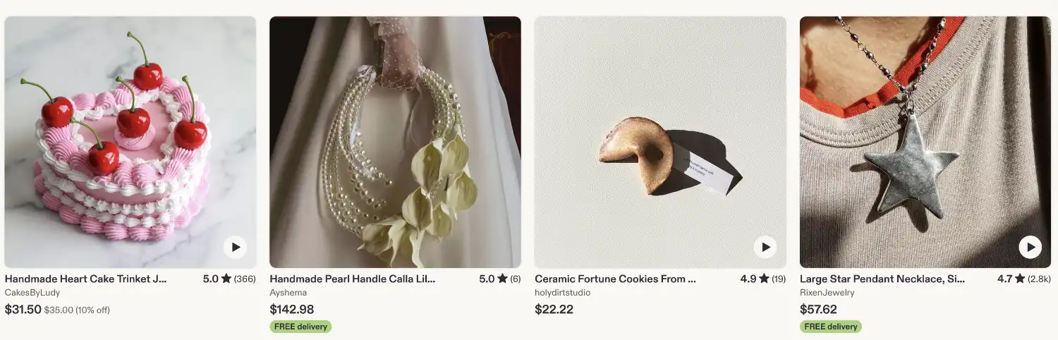
Fill all 13. Use multi-word phrases rather than single words ("ceramic coffee mug", not "ceramic", "coffee", "mug"), and mix three kinds: your title keywords, synonyms and variations shoppers might use ("mug" and "cup"), and the angles your title didn't cover: the occasion, the recipient, the style ("housewarming gift," "gift for dad," "cottagecore kitchen"). Your keyword list from earlier in this step should fill these in minutes.
6. Write the description with the GYC formula
Descriptions get skimmed, not read, so structure does the persuading. Here's the formula, top to bottom. The first three parts belong in every listing; the rest you include when they fit your product.
Opening paragraph: catch attention. One or two sentences carrying your most compelling selling point: what you're selling, and why your target customer will love it. Work 2 or 3 of your long-tail keywords in naturally, because Etsy reads this paragraph for keywords, and so does the shopper deciding whether to keep going. This is also the perfect home for the phrases you collected from competitor reviews back in Stage 1; when your opening echoes the words shoppers already use, it reads like you know them. Because you do.
Supporting paragraph: expand the benefits. Two or three sentences on your key product benefits, focused on the customer: how it solves their problem or makes their life better. Not "this candle is made with soy wax," but "it burns clean for 40 hours, so your evening ritual lasts all month."
Benefit bullet points. Three to five bullets mixing benefits with features, always leading with the advantage, the transformation, the positive outcome your customer gets. "Fits a standard nursery shelf" beats "15 cm tall," and the best bullets manage both at once.
Shipping and delivery information (optional). Set expectations on when the order will arrive. Especially important in the holiday season, when "will it make it by the 24th?" is the question quietly deciding the sale.
Gift wrapping and packaging information (optional, strongly recommended if your product can be bought as a gift). Say whether you can include a custom note, leave out the invoice, or gift wrap the order, and point to the packaging shot in your gallery so they can see it. Gift buyers are a huge share of Etsy shoppers, and this small section speaks directly to them, never more so than in gifting season.
Product details. The essential facts about your product, in bullet points for readability: dimensions, materials, care, how personalisation works, processing time. Your maker's detail line from Step 5 lives happily here. The Product Description Formulas in your Toolbox include a checklist of what to cover for multiple niches and product categories.
Guarantee (optional). One plain sentence standing behind your work removes a surprising amount of doubt: "If it arrives damaged, I'll replace it, no questions asked."
Social proof (optional). If you have a large following, a feature in a well-known magazine, or a milestone worth naming, this is the place to show it off. One or two customer testimonials work beautifully too, with the customers' permission.
Write it once, in your brand voice from Step 1, and it becomes the template for every listing after.
7. Sweep for barriers
Last pass. Read the listing as your persona from Stage 1 and hunt for any unanswered question: Will it fit? Is the colour accurate? Will it arrive by the birthday? Can I get it in blue? Every question you answer inside the listing is a message you never receive and a sale you don't lose to hesitation. The recurring complaints you collected from competitor 2 to 4 star reviews are your barrier checklist. Make sure your listing visibly solves them.
Go deeper: How Etsy Search Really Works (every ranking factor, and the ten places to find keywords) · The Customer Psychology Modules (social proof, authority, and anchoring inside a listing)
Toolbox: Product Description Formulas · Listing Checklist
If your shop isn't open yet, this is the easy part. You've already done the hard thinking; opening is just following some simple steps. If your shop is already open, treat this step as a storefront polish: work down the same list and upgrade anything the earlier steps have now outgrown.
1. Settle the name
Three tests for a shop name: easy to say and spell (someone hearing it aloud could find it), roomy enough to grow into (name the shop for the niche or the feeling, not one product you might outgrow), and available where it matters (the Etsy name and the social handles you claimed in Stage 1 should match, or near enough). Run your candidates past your positioning sentence; the right name usually sounds like it.
2. Set up the machinery
Work through Etsy's setup in order: shop country, language, and currency (list in the currency of your payment account and you'll dodge conversion fees later), then payments and billing so money can actually reach you. This only needs to be done once.
3. Dress the storefront
Upload your shop icon and shop cover photo from the Step 1 assembly line, publish your About section with the maker story and workspace photo from Step 5, and fill in your shop announcement with one warm line in your brand voice. A complete, coherent storefront tells shoppers someone is home, and it tells Etsy this shop is here to trade.
4. Publish your policies
Clear policies help you close sales. Cover four things, in plain language: processing time (be honest, then pad it slightly, because early is a delight and late is a complaint), shipping expectations, your returns and exchanges stance (accepting returns builds buying confidence; it's fair to have the buyer cover return postage for a change of mind, while you cover it when something arrives wrong), and whether you take custom orders. You'll lean on these policies in Stage 3, so write them like you'll be quoting them. You can also consider using the Etsy shop policy template to speed things up; Just make sure the information is accurate.
5. Publish the listings, assembly-line style
Build your first listing carefully, end to end: photos, video, title, tags, description, price, the works. That's your master. Then use the duplicate listing function and quick edit to roll out the rest, swapping in each product's photos and keywords. Aim for at least 10 listings at launch. Having at least 10 listings give you enough chances to rank on relevant shop page, and something for shoppers to browse when they land in your Etsy shop.
Then take a breath, and press open shop. Congrats!
Toolbox: Shop Announcement Swipe File
While you build, document. This stage hands you a month of effortless content: your brand board taking shape, a test parcel wrapped for its portrait, the window-light photo setup, the first listing going live, the small ceremony of pressing open. Post 1 or 2 of these behind-the-scenes moments a week using the Instagram Post Templates. Nobody expects polish from a shop being born; they find it charming, and people who watch something get built feel quietly invested in it succeeding.
Two more small moves this stage:
- Set up your link-in-bio. A simple page with your (soon-to-be-live) shop link and an email sign-up, sweetened with a small "first look" incentive: early access to the launch, or a little launch discount. It will feel premature. That's the point. The handful of people who join now are the warm crowd at your launch, and the seed of the list that becomes a system in Stage 4. This is also where your insert card's QR code points, so the two are working together from day one.
- Keep the radar running. Keep liking and saving strong posts in your niche so your trained feed keeps delivering what's resonating in your corner of the market. It will quietly inform your photos and products all the way through the roadmap.
That's exactly what Stage 3, Get Traction, is about. The data starts talking: which listings earn clicks, which convert, which quietly stall. You'll learn to read your shop stats, earn your first steady sales and reviews, and run your first careful ad tests. The workbench is set, the doors are open. Now we make it sell.