This module is about how you can boost your conversion rate systematically. We will understand the buyer's mental journey, learn the two emotional triggers to create desire, take down the five purchase barriers, use the informational photo system that sells to shoppers who never read, and truly understand the anatomy of bestsellers across five niches.
The 6-Gate buyer journey
If you've ever seen hundreds of views and zero orders, you have a conversion problem, and conversion problems are best understood as a journey with checkpoints. A sale isn't a single event; it's a series of psychological gates the shopper passes through in order, like levels in a video game. You cannot unlock Gate 4 (Trust) if the shopper never made it through Gate 2 (Desire). When a listing gets traffic but no sales, the customer is getting stuck at a specific gate, and your job is to find which one.
The two phases behind the gates. In Phase 1, the heart phase, the shopper is asking "do I want this?" They scroll fast, scan photos, and react emotionally; fail here and they bounce straight back to search (which also hurts your ranking). In Phase 2, the brain phase, they want it and switch to "is it safe to buy this?" They read fine print, check delivery dates, and hunt for reasons not to buy. Your job flips from creating desire to removing friction.
Gate 1: Initial interest (the click). The test: does this look relevant and high quality? On a crowded search page, the decision is made in a split second by your thumbnail and title. If your click-through rate is low, this is your broken gate: the photo is dark or cluttered, or the title doesn't match search intent.
Gate 2: Desire and recognition (the hook). The test: does this improve my life? You have about three seconds after the click. Shoppers scan for lifestyle photos that let them see the product in their life; a gallery of nothing but white-background shots fails here because there's nothing to feel.
Gate 3: Product suitability (the details). The test: is this the specific version I need? Now they dig: size, material, compatibility, file format. The failure mode is confusion. If a shopper has to message you asking "how big is this?", the sale has usually already gone to a competitor who put the dimensions in a photo.
The pivot point. Once Gate 3 is passed, the customer wants the item, and the brain takes over. Everything afterwards is more logic-based.
Gate 4: Seller trust (the handshake). The test: is this shop legitimate? The shopper looks away from the product and at you: your review count, your Star Seller badge, your About section, your branding. A shop with no banner, a low-res logo, or defensive replies to negative reviews raises quiet alarms. (Your Stage 2 brand kit and human-made proof were built for exactly this moment.)
Gate 5: Value justification (the price check). The test: is it worth the money? They weigh the desire built in Phase 1 against the number on the tag. The lever here is perceived value: craftsmanship, materials, packaging, story. And note the dependency: if you didn't build enough desire at Gate 2, no price will ever feel right at Gate 5. The answer to price objections is almost never a discount; it's a better Phase 1.
Gate 6: Logistics and risk (the safety net). The test: what if something goes wrong? The final glance goes to the delivery estimate and the return policy. Vague shipping ("1-3 weeks") and harsh policies ("NO REFUNDS EVER") kill sales at the last second.
The order-of-operations rule. The biggest listing mistake is leading with Gate 6 material: opening your description with shipping rules and policy warnings. That's leading with friction before desire exists. Lead with the transformation ("Transform your morning routine with..".) and let the logistics reassure later, exactly as the GYC description formula orders things.
Diagnosing with the gates. This framework turns your Stage 3 dashboard reading into surgery. Views but no clicks is Gate 1 (thumbnail and title). Clicks but no favourites or dwell time is Gate 2 (lifestyle photos, emotional copy). Favourites but no carts is Gate 3 or 4 (missing details, thin trust). Carts but no checkouts is Gate 5 or 6 (value story, policies, delivery dates). Walk your weakest listing through the gates and the repair usually names itself.
The two emotional triggers
Customers don't buy things. They buy outcomes. Nobody buys a "digital planner"; they buy control over a chaotic life. Nobody buys a "knitted blanket"; they buy a cosy sanctuary. The golden rule of conversion: logic justifies the purchase, but emotion drives the decision. Since you can't stand beside the shopper like a salesperson, your listing does the talking, and here are two directions you should go in.
Trigger 1: Improving life (the dream driver). These purchases bridge the gap between who the customer is and who they want to be: the thoughtful gift-giver, the eco-conscious friend, the parent raising a curious child, the person who finally paints. Montessori toys aren't wooden blocks; they're the identity of a mindful parent. A custom portrait isn't a drawing; it's being the most sentimental partner in the friend group. To use it: show the after state. Your photos and copy should depict the joy, pride, or beauty on the other side of the purchase.
Trigger 2: Reducing pain (the relief driver). Often the stronger of the two, because humans are wired to avoid pain, and on Etsy pain looks like stress, wasted time, inconvenience, and uncertainty. Templates cure the pain of the blank page; meal planners cure the nightly "what's for dinner" load; fidget toys sell calm. To use it: agitate gently ("Tired of losing your keys?"), then present your product as the immediate cure.
The search bonus. This isn't only persuasion; it's visibility. Etsy's semantic search reads context, not just keywords, so a listing written around its emotional driver starts ranking for intent searches: not just "planner" but "ADHD organisation tool", not just "bath salts" but "relaxing self-care gift". Emotion in your copy is helping your Etsy SEO as well.
The exercise: find your product's emotional core. For each of your top three products, write a short transformation table: the vibe (cosy, hygge, winter walk), the transformation ("feel enveloped in luxury on cold days"), and the aspiration ("the stylish woman who loves the outdoors"). Who does the customer become when they buy this?
Dismantle These five barriers
Stage 2, Step 6's barrier sweep gave you the checklist. This is the full method behind each item: the five doubts that stop a willing buyer at the checkout, and how to solve each and every one of these.
Barrier 1: "Will it really look like that?" (visual uncertainty)
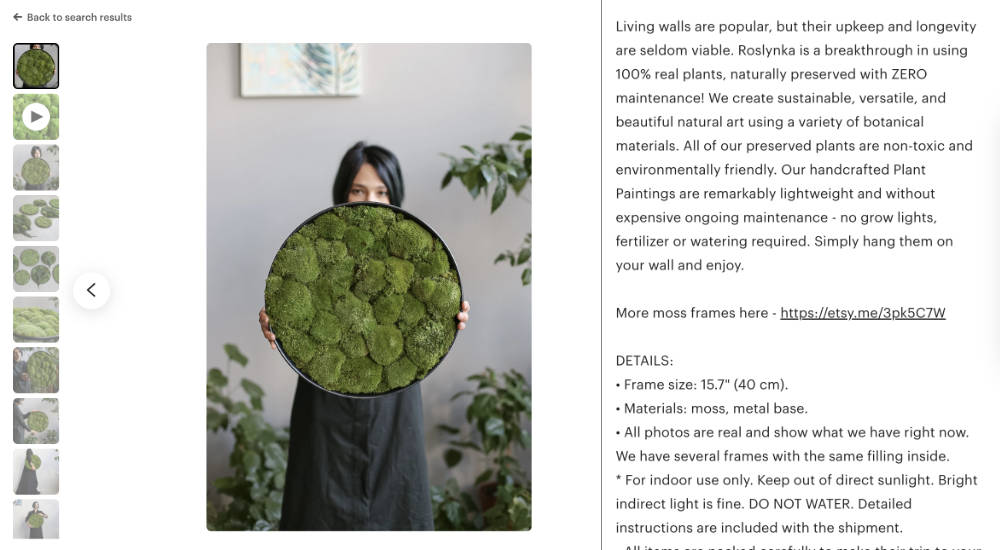
Online buyers can't touch, smell, or try on, and their deepest fear is the catfish: a product that looks nothing like the photo. The cure is visual honesty. Scale is king: never assume anyone knows how big 8 inches is; show the item in a hand, beside a coin, in a room. Colour accuracy: don't over-filter, and if screens vary, say so plainly ("We edit for accuracy, but screen settings vary"). Verify this on multiple screens like your phone, laptop and tablet. Video: the closest thing to touching the product (more below). And reframe handmade variation as the feature it is: "Each piece features unique wood grain, making yours truly one of a kind". That single sentence turns the fear of inconsistency into the reason to buy, and it's your maker's detail line doing conversion work.
Barrier 2: "Can I trust this seller?" (the credibility gap)
On Etsy you're selling yourself as much as the product, and shoppers walk away from anything that smells like an amateur or a dropshipper. You built the main cure in Stage 2, Step 5: the visible human. Beyond that, three amplifiers: state your expertise where you have it ("As a certified gemologist with ten years at the bench..".) rather than the generic "I make jewellery"; keep branding consistent everywhere, because a missing banner whispers "this shop might vanish tomorrow"; and answer messages fast, since your response rate is public and speed signals you'll be there if something goes wrong after purchase.
Barrier 3: "Do others actually like this?" (the social proof void)
Nobody wants to be the guinea pig. Beyond accumulating reviews (your Stage 3 engine's job), surface them: a gallery graphic featuring a glowing review (with the customer's permission), a line in your description summarising the themes ("Customers consistently mention how soft this fabric feels"), the Star Seller badge earned through Stage 3's habits, and customer photos from your socials, because a real person using the item in the wild dissolves doubt like nothing else.
Barrier 4: "What if I hate it or it breaks?" (risk aversion)
The heaviest friction of all: "what if I'm wrong?" You don't need a no-questions-asked policy, especially for custom work, but you do need to shrink the fear of being stuck with a dud. Detailed sizing and "fits true to size" notes prevent the most common regret. A stated return policy always beats none, and if you can't accept returns, explain why and offer the alternative: "While I can't accept returns on custom pieces, please message me if anything's wrong; I want you to love your order". And phrase every policy as a safety net rather than a warning. "NO REFUNDS. NOT RESPONSIBLE FOR DAMAGE" kills sales; "Insured shipping included. If your item arrives damaged, contact me immediately for a replacement" makes the same rules feel like protection.
Barrier 5: "When will I get it?" (logistics anxiety)
In the age of next-day delivery, uncertainty is the enemy, and a gift buyer needs a date. Keep processing times honest and slightly padded (the roadmap's promise-and-beat rule), make sure your shipping profiles are set so Etsy can show an accurate "arrives by" date (it's the first thing buyers check), add a holiday cutoff graphic to your photos in Q4, and mention your packing in one line ("ships in a crush-proof box"), which quietly answers a worry most shoppers never voice.
Every barrier removed is resistance removed. Walk your listings quarterly with these five in hand and ask: am I asking this shopper for a leap of faith, or have I built the bridge?
Informational photos: your gallery as a slide deck
Here's the hard truth on Etsy: many shoppers don't read. On the app, your description hides behind a tap, so a large share of buyers will scroll your photos, check the price, and decide without reading a word you wrote. If crucial information lives only in your description, many shoppers may never see it. The fix, which Stage 2, Step 4's shot list introduced: using text overlays on your photos to answer buyer objections. Build them from the 250 Listing Photo Templates in your Toolbox, in your brand kit.
The thumbnail stays clean (its only job is Gate 1: the click), though a small badge for an invisible USP ("Instant Download", "2026 Updated") can outperform a plain image when the selling point can't be seen.
Then choose from the catalogue, matched to your product's barriers:
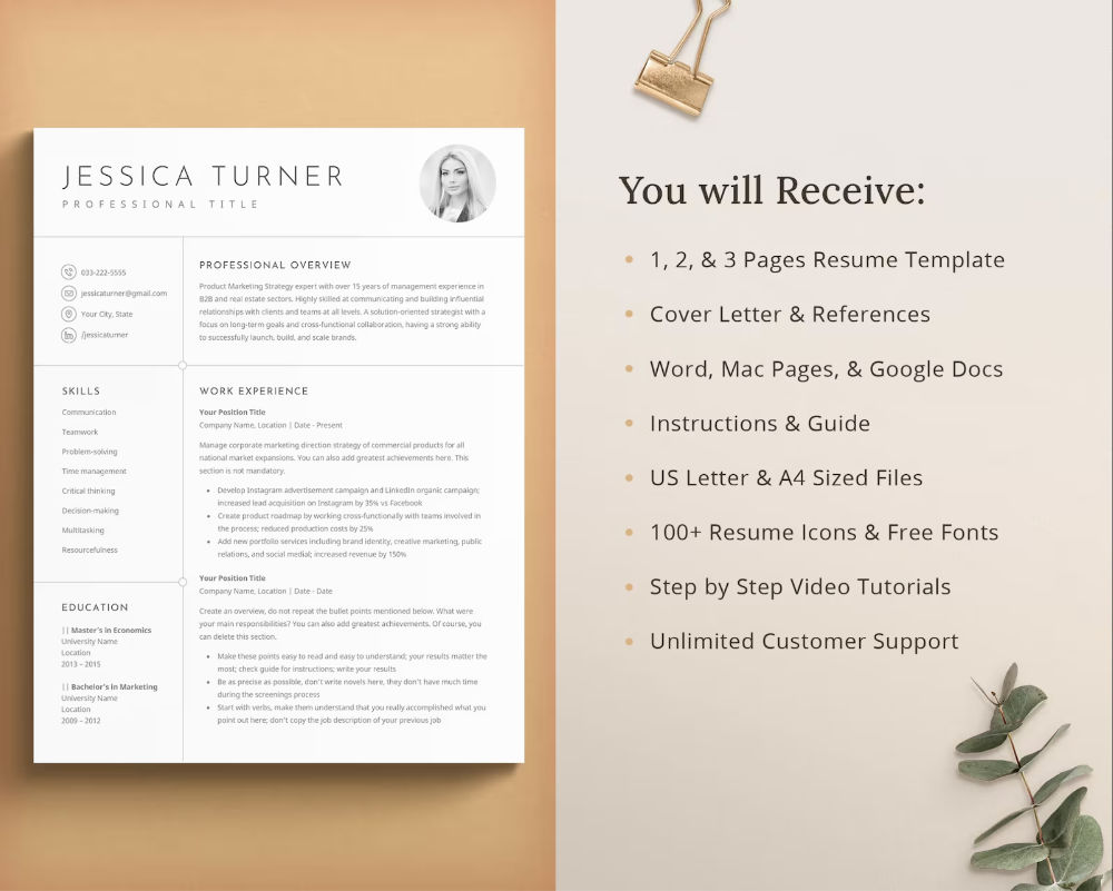
Feature list photo. Product on one side, three to five punchy features on the other. The at-a-glance version of your description for people who won't read it.
Customer review photo. A five-star quote, beautifully set, with permission. Social proof inside the gallery, where it's actually seen.
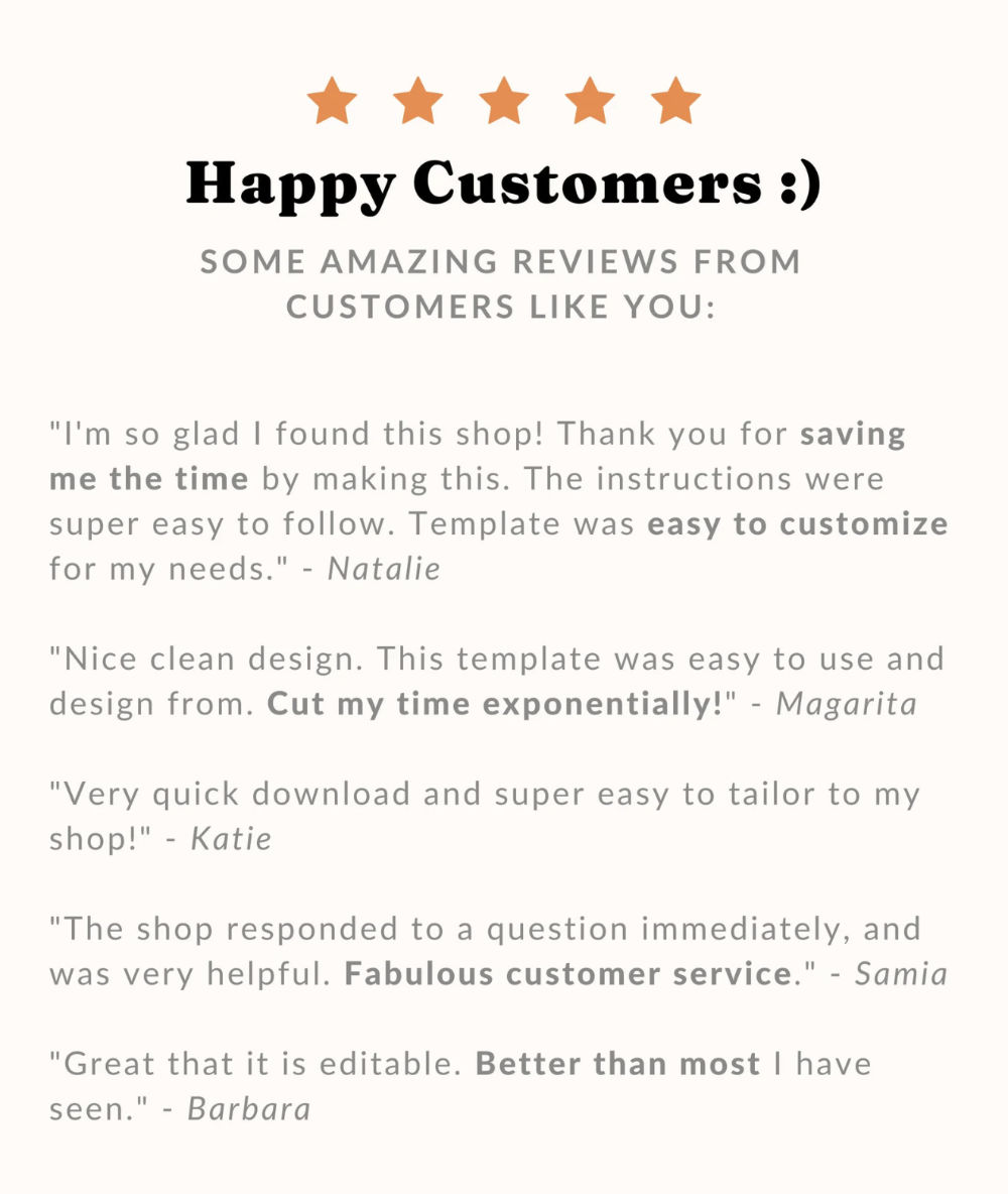
FAQs photo. The three to five questions your messages keep asking, answered visually. Mine your inbox and your competitors' Q&As for the list.

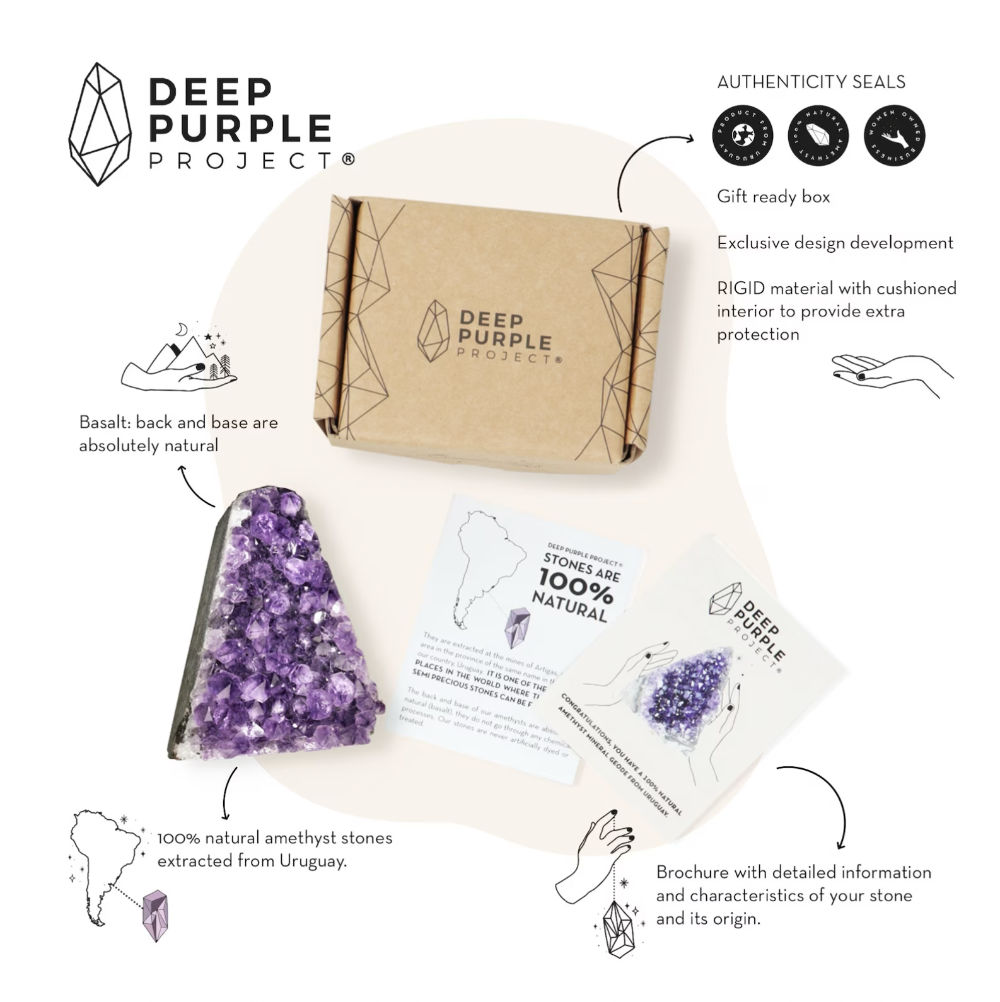
Packaging detail photo. Gift-ready presentation, protective packing for fragile work, the handwritten note option. Raises perceived value at Gate 5 and answers the gift buyer's biggest question.
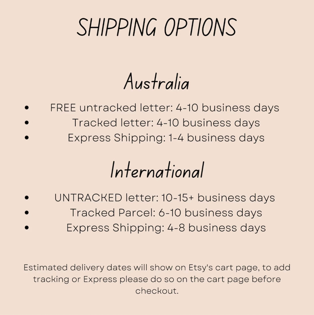
Shipping information photo. Processing plus transit, cutoff dates in season. Essential for made-to-order and international sellers.
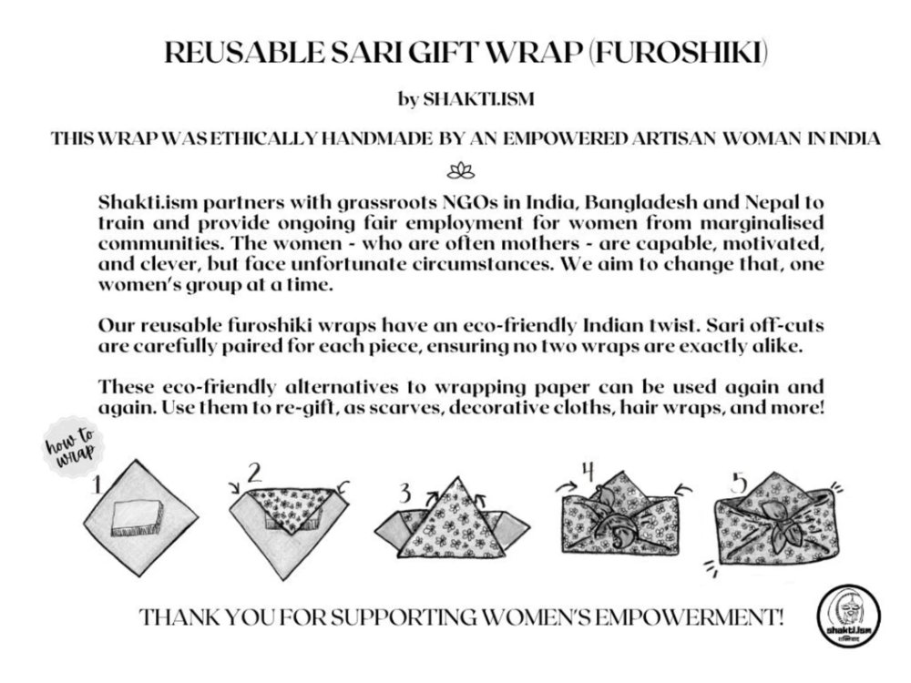
Use guide photo. Simple tips for products whose use isn't obvious.
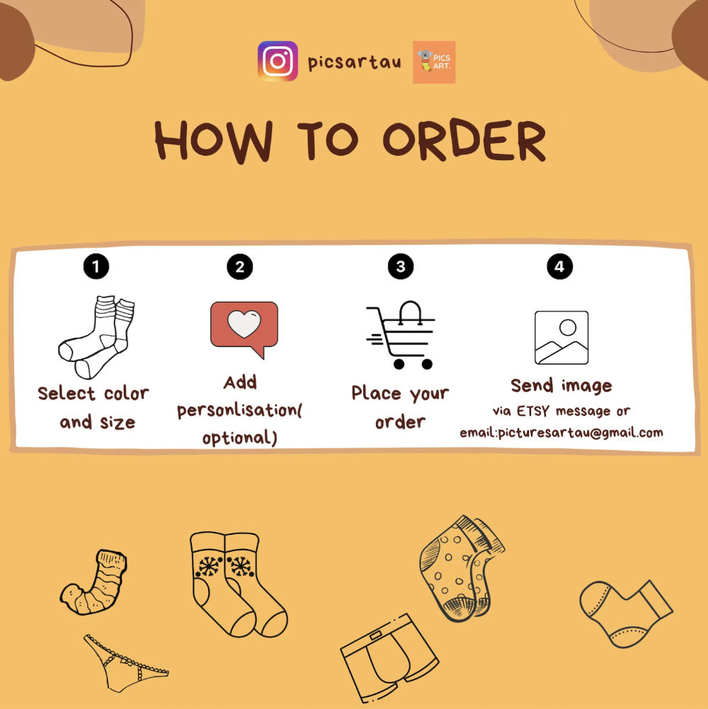
Buying process photo. A three-step "how to order" for anything customised. Simplifies what feels daunting and prevents the confused exits of Gate 3.
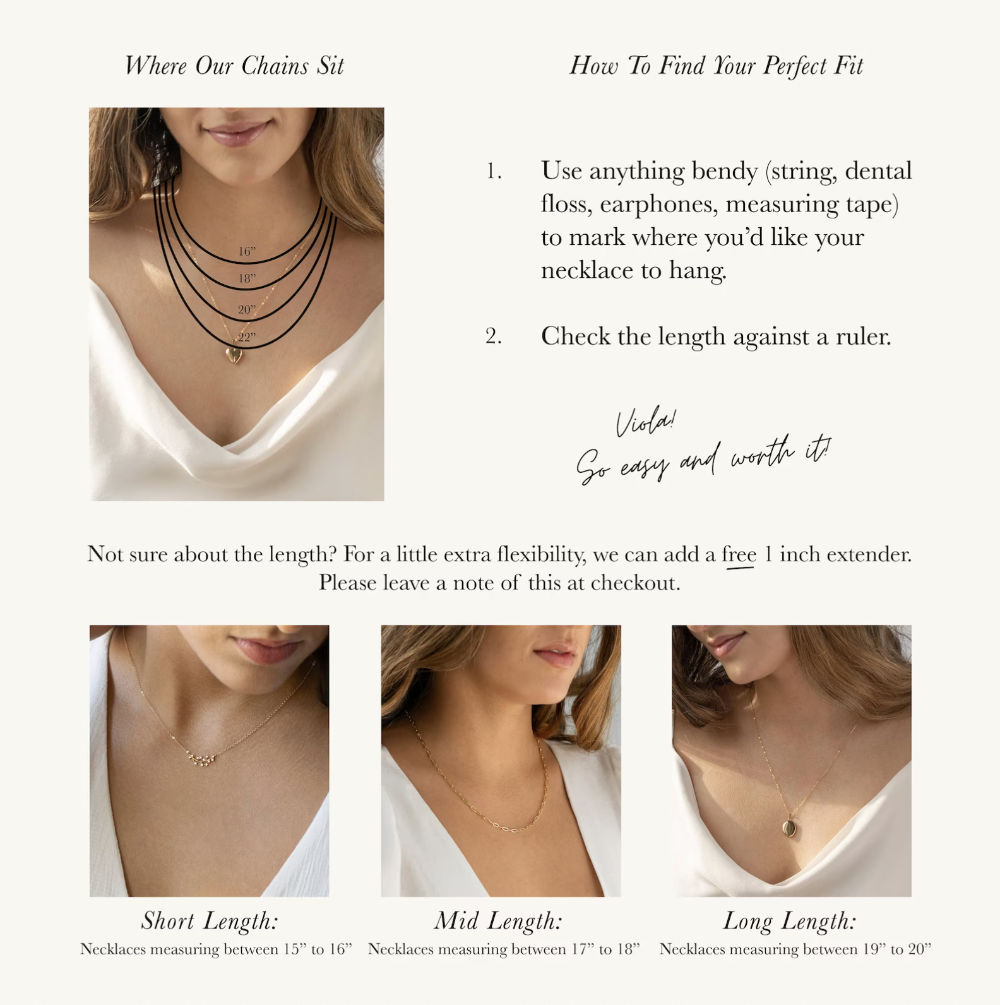
Size chart photo. For jewellery, clothing, anything with fit. Reduces uncertainty and the returns that follow it.
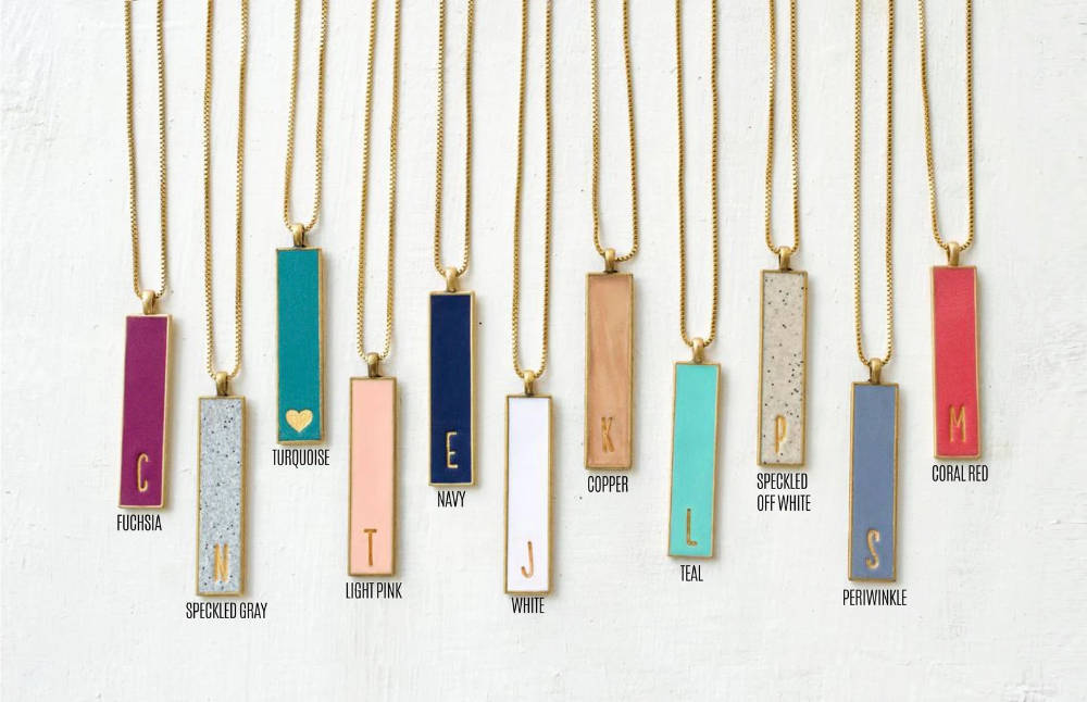
Colour chart photo. When the dropdown can't show your range and colours, use a photo to do that.
The listing video
Stage 2, Step 5 taught the two core formats (the process clip and the hold-and-turn) and the spec: 5 to 15 seconds, silent, filmed on your phone in window light. Three additions from the conversion side. First, videos autoplay when shoppers hover on the search page, which captures attention before the click, and they hold visitors on your listing longer, a positive search signal. Second, there's a third format worth knowing: the pack-with-me, a fast-motion clip of you wrapping an order, which sells the gift experience and proves the maker at once. Third, since videos play silently, never rely on a voiceover; if something needs explaining, use short text captions on the video itself. And don't chase polish: slightly imperfect phone footage often converts better, because it feels exactly like what it is, which is a real person who made a real thing.
Anatomy of a bestseller, niche by niche
Five products, and what their listings must carry. Read your own niche, then read the others anyway because the skill of creating a bestselling listing transfer.
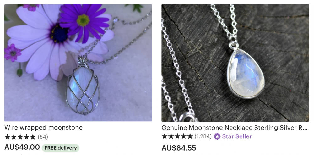
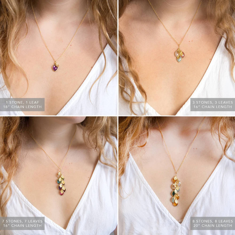
Jewelry. The first unspoken question is longevity, so answer it with evidence: "Made with 925 sterling silver" beats "high quality" every time, and a guarantee, if you offer one, belongs in a photo. A sizing guide dissolves the fit fear. And because jewellery is bought as gifts year-round, with many buyers shipping directly to the recipient, gift-ready packaging and a custom card option deserve their own photo.

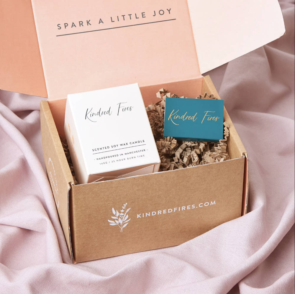
Candles. Most candle buyers are decorating, so lifestyle photos of the candle in a real room let them place it in theirs. If yours are hand-poured, one photo of you making them separates you from every mass-produced competitor on the page (your Stage 2, Step 5 process shot, doing exactly its job). Then answer the standard questions visually: burn time, scent ("fill your room with sweet citrus and relax"), and materials (natural? vegan?). Beautiful packaging earns its own slot.
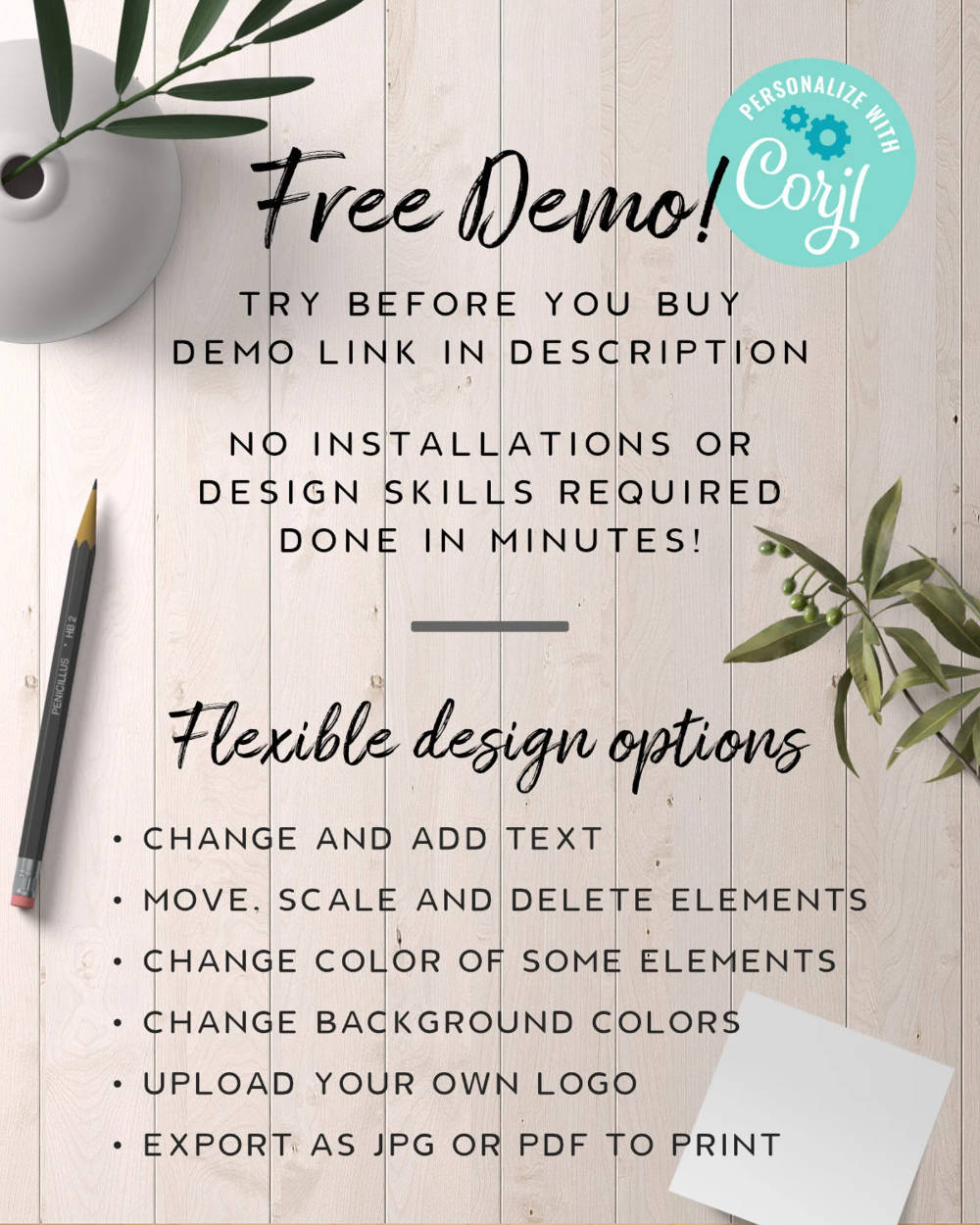
Digital products. The buyer's worries are all practical: how do I download it, how do I print it, what exactly is included, what's editable? An ordering-process graphic, dot-point size and format lists in both photo and description, clear "what's editable" statements, and a demo link where you have one. (These pair with the digital seller notes throughout the roadmap.)
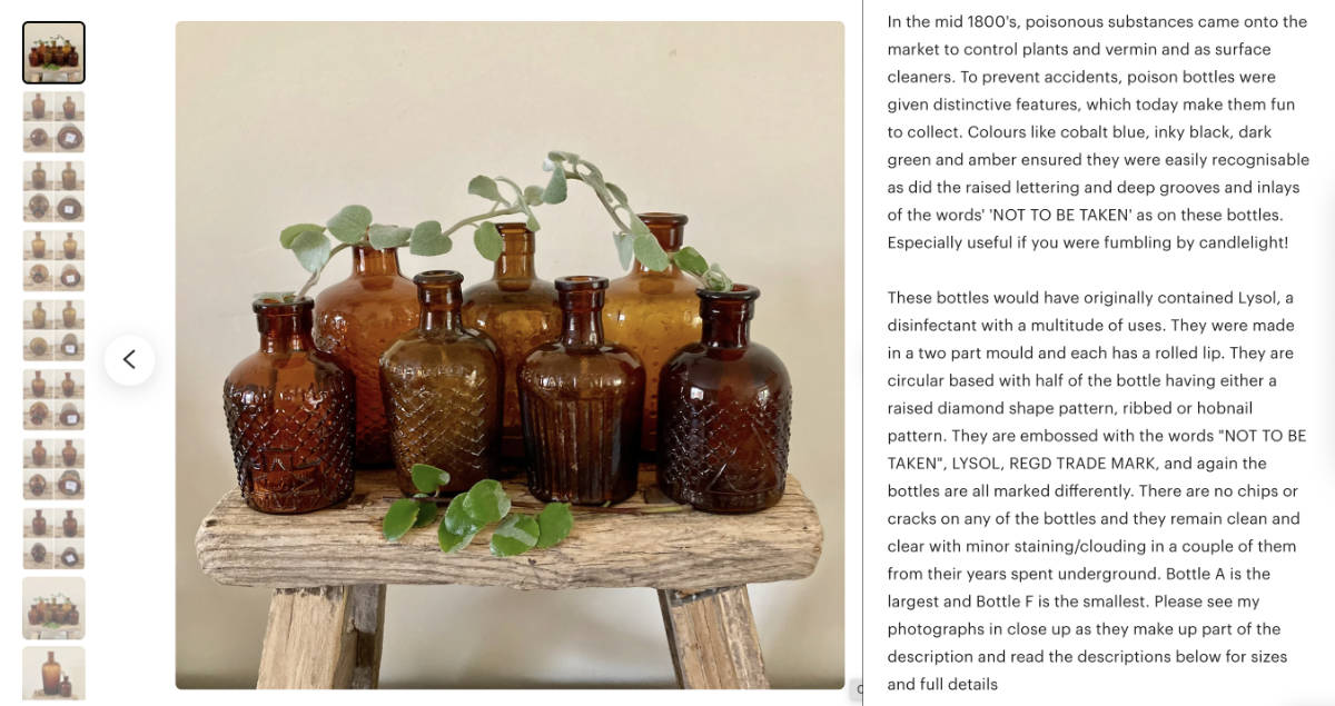
Vintage. Vintage buyers hunt the real deal, so provenance is the product: where it came from, how it was sourced, the story behind it. Educate generously, because expertise creates trust. Show the true condition honestly, flaws included, since pointing out imperfections sets expectations and reads as integrity (the rough-edges principle, vintage edition). And show your protective packaging, because "will it survive the post" is this niche's loudest fear.
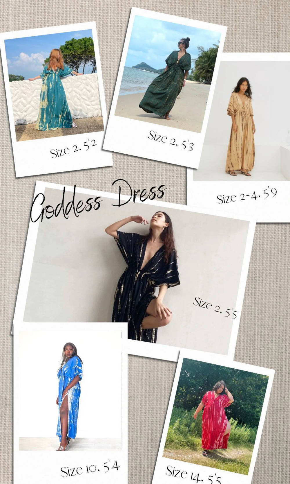
Dresses and clothing. Sizing is the barrier, full stop: a measurement-conversion size chart is mandatory, a model wearing the piece (with "model wears size M" noted) makes fit real, and multiple models in different sizes is better still. Photograph fabric in natural light so texture survives the screen, add care instructions for the "is it hard to look after" worry, and give any standout feature (pockets, always pockets) a close-up with a caption.