You have built the list. You have the subscribers. But if they don’t open your emails - or worse, if they open them and immediately unsubscribe - your effort and time are wasted.
Many Etsy sellers freeze up when it comes to writing. They think they need to sound like a "big corporation" with professional graphics and formal language.
This is a mistake.
Your biggest advantage as a handmade seller is that you are a real person with personality. Your emails should reflect that. In this chapter, we will master the art of email copywriting, from the subject line hook to the final click, while keeping it true to yourself
Phase 1: The Subject Line (To Make Them Open)
The subject line is the most important part of your email. If it's not well written, it doesn't matter how well your body is crafted or how good your offer is, because your emails are not going to get opened.
The majority of emails are read on mobile devices. This means you have limited screen space (usually about 30-40 characters) before your text gets cut off. You need to be punchy, curious, and clear.
5 Strategies for Clickable Subject Lines
Curiosity Gaps
Ask a question or make a statement that makes the reader wonder "What?"
- Bad: "New jewelry listed."
- Good: "The hardest gemstone on Earth is..." (Answer: Diamond)
- Good: "Do you know this trick for cleaning silver?"
Scarcity & Urgency
If a sale is ending, say so. But be honest - fake urgency destroys trust over time. Examples: "Last 24 Hours! ⚠️" or "Grab 1 of the 3 left in stock."
The "Personal" Touch
Lowercase letters sometimes perform better because they look like an email from a friend rather than a blast from a corporation. Example: "quick question for you..."
Use Emojis
These add a pop of color in a grey inbox. Use them to draw the eye, but don't overdo it. Example: "🎃 Trick or Treat! The Halloween Collection is here."
Avoid Spam Triggers
Email providers (Gmail, Outlook) filter out aggressive sales language. Avoid using ALL CAPS or excessive dollar signs ($). if you write something like "FREE MONEY CLICK HERE!!!!", your email will likely go to spam immediately.
Phase 2: The Body Copy (To Make Them Click)
Once they open the email, how do you keep them reading? This part helps you to intrigue them, keep their attention and entice them to click your link.
The "Write to One Person" Rule
Never write "Hi everyone" or "Hey guys". It reminds the reader they are on a mass marketing list. Instead, write as if you are emailing a single friend. Use "You" and "I". Most email tools allow you to insert the subscriber's first name automatically, so use this feature!
For example, write something like "Hi [Name], I was just packing an order and thought of you..."
Keep It Short and Scannable
People don't read on the internet; they scan. So use:
- Short Paragraphs: No more than 2-3 sentences per block.
- Simple Language: Avoid jargon. If you sell knitwear, don't use complex technical knitting terms unless you are selling patterns to other knitters. Speak the language of the buyer, not the maker. Even if you have to, give a quick explanation and why it's relevant to your customers.
- Bullet Points: Use them to break up lists of benefits.
The "One Goal" Rule
Every email should have one primary purpose. Just one. If you are launching a product, don't also ask them to follow you on Instagram AND read your blog AND fill out a survey. Confused people don't click. Give them one clear button: "Shop the Collection" or "Read the Guide". So if you have more than one thing you want them to do, it's a good idea to split into multiple emails.
The Power of the p.s.
Studies show that after the headline, the p.s. (postscript) is the most read part of an email. People often scroll to the bottom to see how long the email is, and their eye catches the p.s.
- Use it to reiterate urgency: "p.s. The sale ends tonight at midnight!"
- Use it for a soft ask: "p.s. Loving your new mug? It would mean the world if you left a review."
Phase 3: Design & Layout (The Visuals)
Here is a counter-intuitive fact: Ugly emails often sell better.
Heavily designed emails with multiple columns, massive header images, and fancy borders often get filtered into the "Promotions" tab in Gmail, meaning the user never sees a notification.
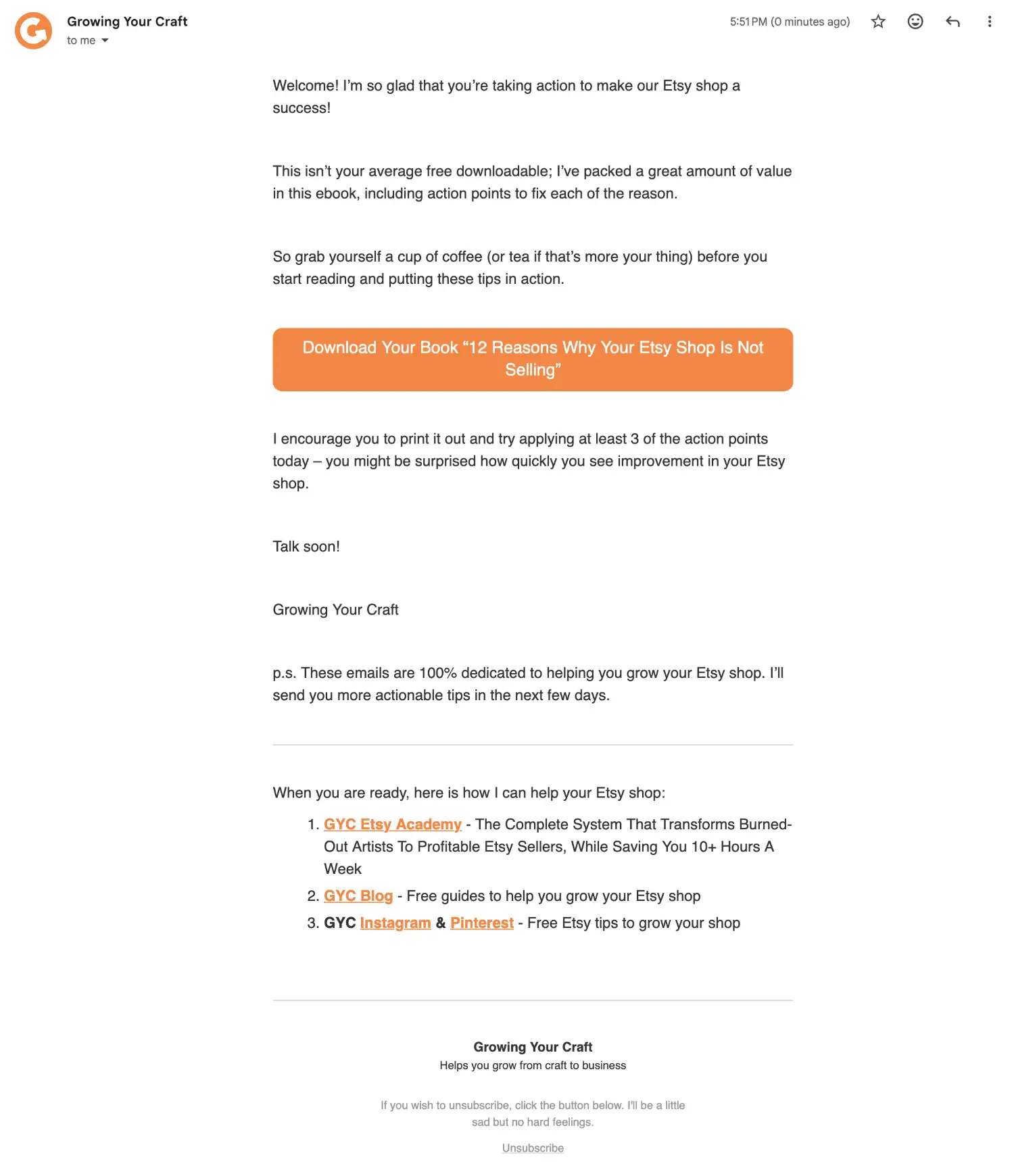
Simple, text-based emails (that look like a standard email) land in the "Primary" inbox.

Best Practices for Layout:
- Logo: Keep it small at the top.
- Text: Use a standard, easy-to-read font (Arial, Helvetica, Open Sans) at 16px size for mobile readability. You don't need fancy fonts.
- Images: Only use photos if they are necessary (e.g. showing the new product). Avoid using images as text (e.g. a flyer saved as a JPEG), because if the images don't load, your message is lost.
- Buttons: Make your links obvious. Use a button with your brand colour.
Phase 4: Optimization (A/B Testing)
Once you are comfortable writing, you can use data to improve. Most email platforms (like MailerLite or ConvertKit) offer A/B Testing. This allows you to send two versions of an email to a small percentage of your list (e.g. 25%).
- Version A: Subject line: "The Fall Collection is here!"
- Version B: Subject line: "You've never seen these colours before... 🍂"
The system waits to see which one gets more opens or clicks (after a period of time set by you), then sends the winner to the remaining 75% of your list automatically.
Note: A/B testing requires a decent sample size to work. If you have fewer than 1,000 subscribers, don't worry about this yet. Focus on consistency and quality content first.